 As a reviewer, I see the book cover cliche discussion regurgitated and discussed over and over and over again. I usually try not to enter those frays. There are a few reasons for that:
First, art tends to be subjective, and there’s nothing wrong with one person liking what another person hates. No one is right or wrong, it’s just different ways to perceive things and I see no reason to pee in that pool. Monet painted more water lilies than I thought any one human possibly could, but people love his art anyway. Just because there is a lot of something, doesn’t always make it bad.
Secondly, cliches tend to be cliches because they work. The book covers that people pick on (example: the guy wearing a cloak on a cover) tend to be so common because they do effectively pull people in and make them wonder about said cloaked dude on the cover of whatever book. Harp on these overused covers if you will, but they are overused because some marketing guru out there realized that, no matter what bloggers think, these covers are effective.
No, I don’t like every cover I see, and yes, I do occasionally judge a book on its cover (I got one in the mail this week that I probably won’t ever read in public because the cover is too damn embarrassing. I won’t say what the book is, but the cover is tragically bad.). That being said, there was a post on Buzzfeed about nineteen cover art cliches that has made the rounds over the past little bit. I’ve seen bloggers/authors cheering this post on, and I’ve seen bloggers/authors get upset and say that considering any one cover as part of a cliche is shortsighted.
I’m not here to argue what is cliche and what isn’t, or to discuss if cover cliches exist. I’m here to examine the point that whether or not you think cliches exist, we are all (probably) attracted to a cover cliche. I’ll admit, I do think that cover art cliches do exist and I will also admit that they don’t tend to bug me. I am one of those marketing statistics. There is a certain cover “type” that I see all over, all the time and I always pick up those books to see what they are about and, more often than not, I’ll read them.
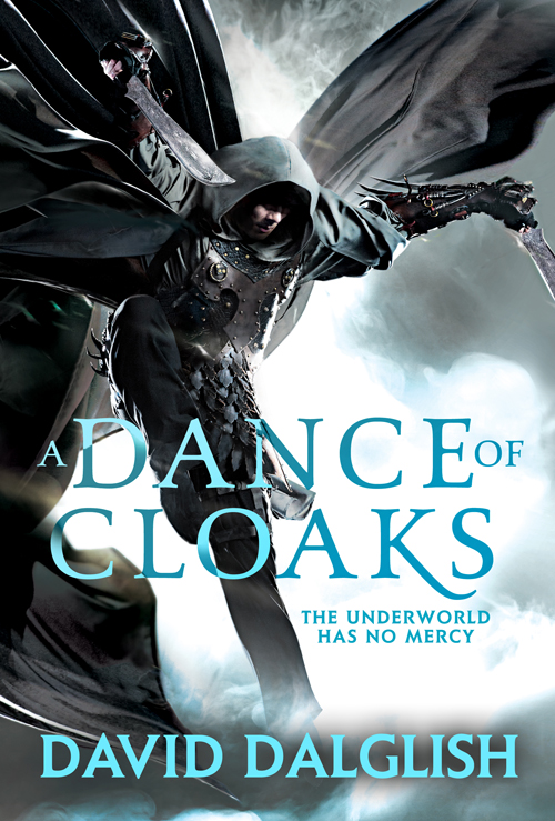
So what is my cover-art-cliche trigger?
The guy in the cloak, or the guy in the cloak holding weapons. I think I must have a secret infatuation with that type of cover. Even though I do think it’s a bit overused, I am in the statistic of people it attracts. I like that guy. Here’s an example of how bad it is. I don’t video game at all and I’m less than interested in any games (I just don’t care, period). However, if my husband starts playing Assassin’s Creed, I stop everything I’m doing to watch. Why? Because the guy wears a hooded cloak and I like that. There’s an air of mystery about him that I enjoy.
What am I leading to?
I’m wondering what cover cliche everyone else is attracted to? I find it interesting that we complain about cover art cliches so often, but we rarely discuss the reasons why a cliche is a cliche, nor do we discuss what kinds of cover art cliches we are attracted to. I bet most of us tend to vacillate toward one form of cover art or another. So what is your poison? And do cover art cliches bother you or not? Why? What makes a cliche and cliche? And are cliches always bad?
8 Responses
I am definitely in that group that judges a book by it’s cover. Hell, I picked up Jim Hines’ Libriomancer because of the great review/recommendation from Patrick Rothfuss (who am I to argue with genius?), but without that rec, there’s no way I would have picked that up.
Simplicity works for me (the George Martin books) and covers that use a lot of darkness with some colors to emphasize the point (The Blinding Knife – though that may feed into your hooded cloak cliche).
I need to put more thought into this now. Fun topic. Thanks.
Oh exciting! Yes, definitely. I would personally like to make a distinction between cliché and trend, though. I think there are certain trends (or shall we call them tropes, even?) that cling to specific genres for dear life.
Hooded man is certainly a vey popular one, especially in SpecFic. You’re also bound to see “bad-ass chick looking over shoulder with weapon in hand and tight black leather clothes” all over the show.
The reason why I like to call them trends, is because they’re just that. Publishers, like most companies, do market research and see what sells the best. I am willing to bet that, if you run a comparison of sales of the same book, but one with a popular cover (say, hooded man) and the other one with something more obtuse (say, an arcane sigil or something) the hooded man covers will sell many more copies. It’s popular – and importantly, leaves the reader with the opportunity of assigning the character’s face (an important thing, in myopinion).
I personally enjoy books with strange symbols on them, such as the Wheel of Time series, and I’m also fond of more abstract things, like a lone sword or dagger.
Wow, okay sorry for barging in like that. Have a nice day 🙂
Mine has to be, and no offense to many urban fantasy novels, is the “Tramp stamped” heroine, with weapons, craning her neck in ways that make Jim C Hines’ body painful!
I’ll put it like this. If you substitute “cliche” with “type”, then that type will (most often) help you find books belonging to a type. So I would say they are always helpful.
Since I’ve removed the word cliche (which seems to always be a negative word), it becomes obvious that these covers are not “always bad”. If you want an assesment of a cover it will always be “worst ever” to “best ever” depending on personal preference. And I think that goes for every single cover out there.
Going back to type, whether you think a type of cover is bad, or good, also depends on personal preference.
I think discussions about cover art are very interesting, and we should absolutely have them. But ultimately a cover’s job is to sell the book, so sales figures is really the only objective metric for whether a cover is good or bad.
I like your use of “type” instead of “cliche.” I just hear the word “cliche” thrown around so often that I wanted to toy with what it actually means. Anyway, I agree with what you are saying. When I think about it, most “hooded guys on covers” are on the covers of books with people who are morally ambiguous and are assassins and/or thieves. I like those stories, and my preference of cover art reflects that.
As for cover art discussions, I tend to overlook them almost completely. Its not that I don’t enjoy them, or think they are useful, I just get sick of them. They do seem to kick that same dead horse over and over again. I’m trying (in vein) to look at it in a different way.
Try to use the word type instead of cliche, and archetype instead of stereotype. That way it’s not already got a negative sounding angle. -I actually think that is the main problem with the discussion being the same. It starts out with using negative words, that sadly has become the standard words, and it’s really hard to get it to turn in a positive direction (,or even a constructive direction, )after that.
You could just take the comments from here and edit them in at the bottom of the post if you want. It’s perfectly fine by me if you do.
I’m with Dork Portal, I like simplicity too. I don’t wear flashy clothes, i don’t wanna read super flashy books. But. . . like those rediculous 4″ blue high heels I have, I do have a major weakness for the original hardback cover art for Rothfuss’s Name of the Wind (the one even the authors calls the “gay” cover art).
LOL, I drop everything and watch when my husband plays Assassin’s Creed too! even without the hood, that guy (whatever his name is) just oozes hotness.
Yes! He is a hottie! I feel so weird being attracted to computer animation!